Mona, the cafe owner, wanted to communicate that the cafe is right in the heart of downtown Columbus. The initial idea was to possibly include a cityscape in the logo. This design includes hearts hidden in the decorative accents as a nod to this idea, as well as to the owner's warm and welcoming attitude. This change in design makes the logo simper and more versatile, but also allowed the re-use of parts of the illustration for accents on the menu.
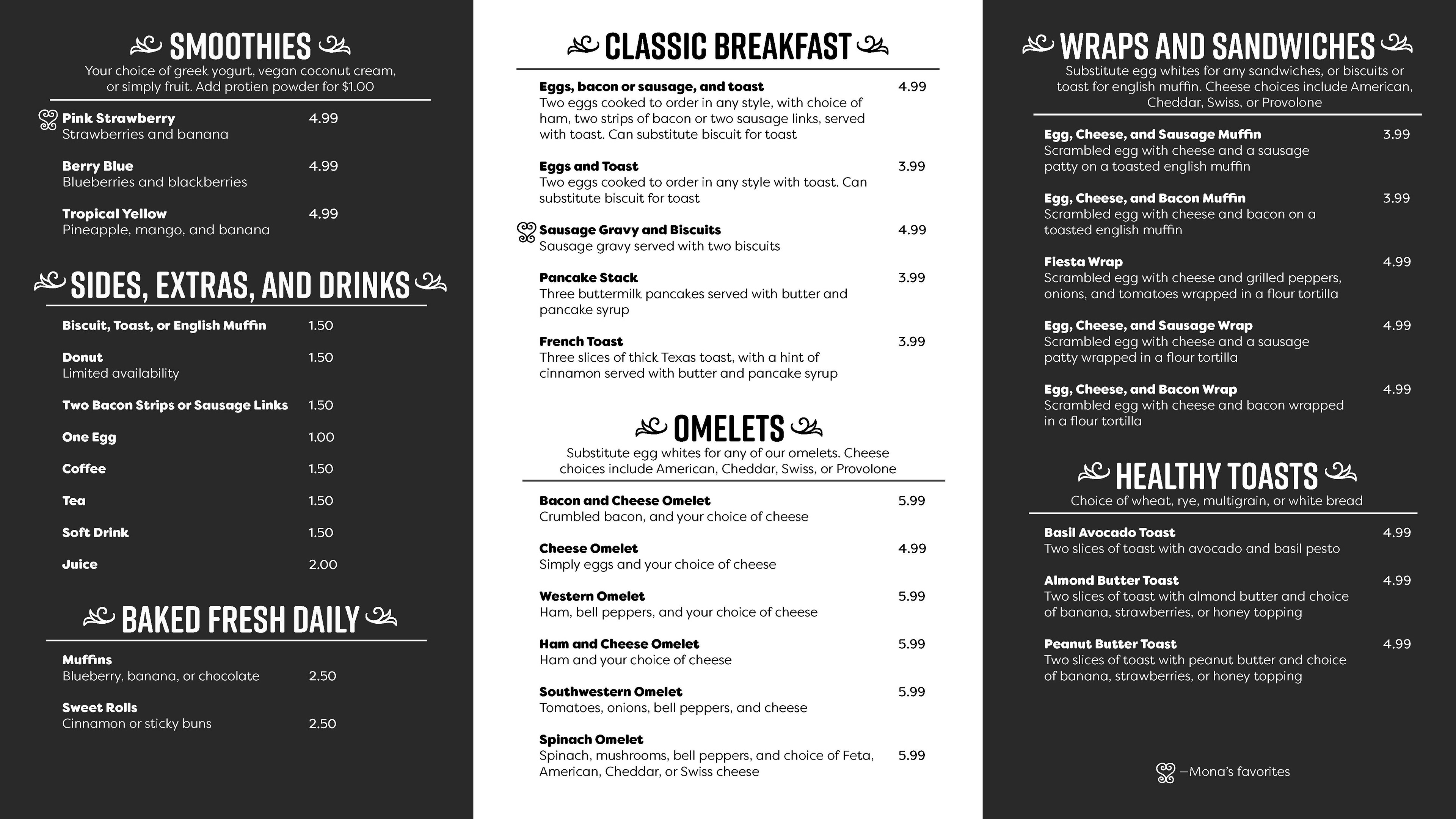
Both menus include illustrated accents that were pulled and edited from the logo. The heart motif was used to indicate dishes that Mona was especially proud or fond of.

The three column design of the menu allowed this layout to be used for small printed trifold menus as well.
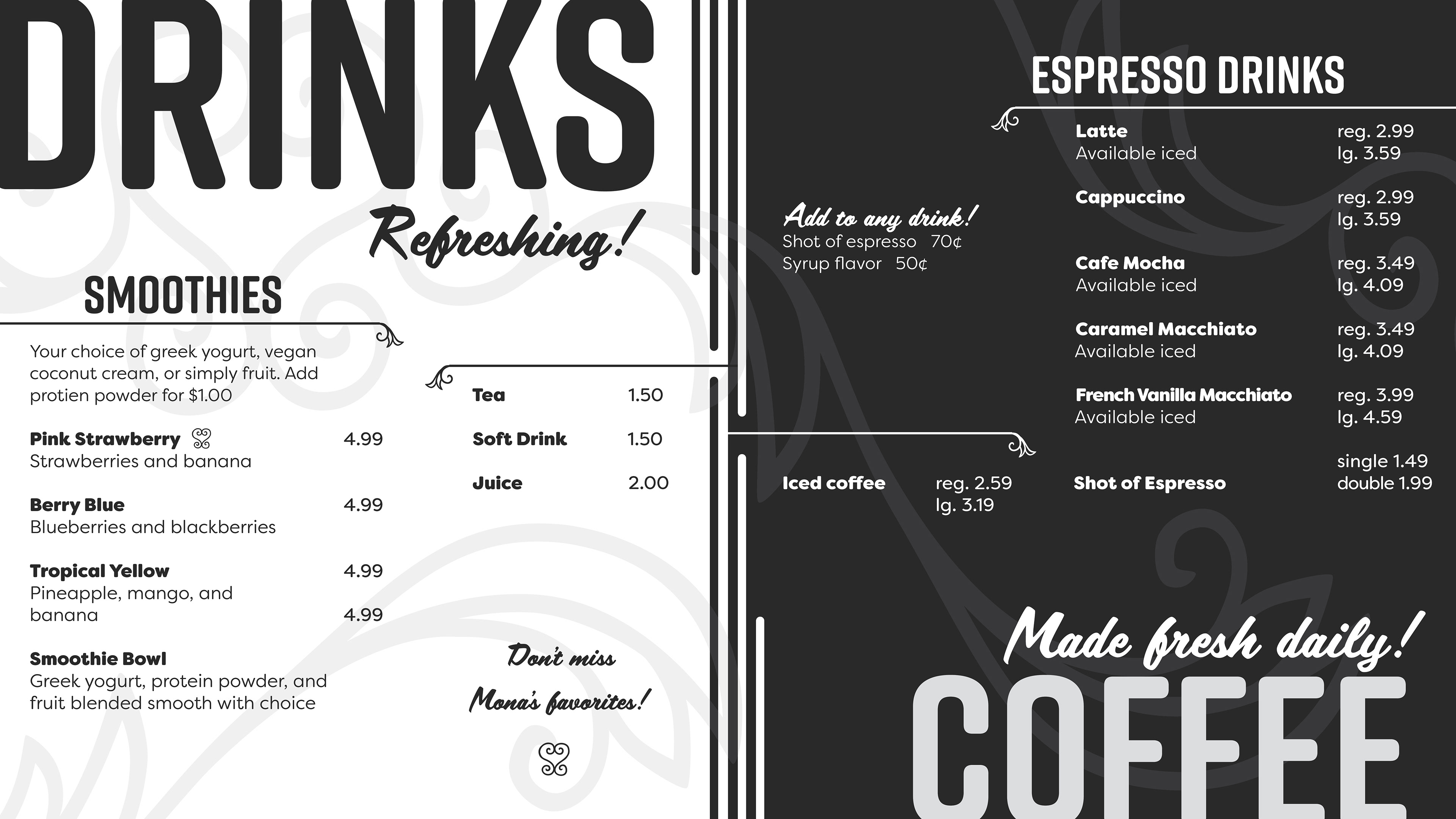
Drinks menu added after an additional TV was added to the cafe.More decorative elements were added to give the design a sleek and elegant feel. The tall lines in the center dividing the coffee and regular drinks section mirror the tall columns that adorn the exterior of the cafe.
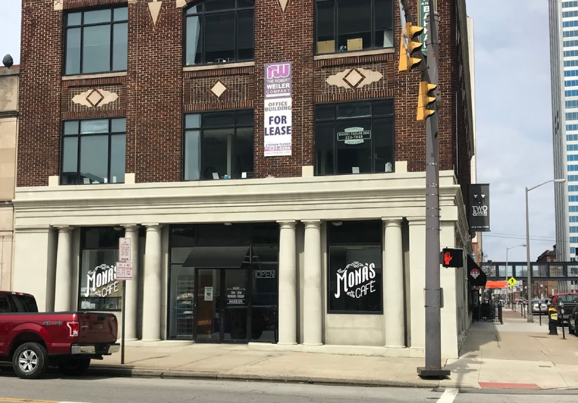
Exterior of the cafe. An initial concern was that there was no room to mount a sign on the building, so the business name had to be put on the windows. The logo was designed with the understanding that it had to work on these dark windows as well as on white printed paper. The name was intentionally made large enough so as to be easily readable from across the street and further out.