
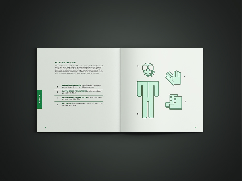
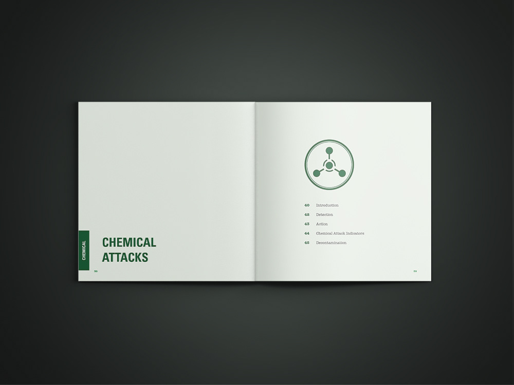

This manual on terrorist attack survival was redesigned as a typographic exercise. Capitalized and bold letters help the reader determine hierarchy of information, while a system of tabs and chapter title pages aid navigation. The colors and textures used were inspired by military items to help the manual feel legitimate and official. The vector diagrams and easy-to-navigate layout were designed to make the manual civilian friendly.